An Unwavering Passion for the Written Word and the beauty of typography
At Gladstone Media, our deep appreciation for the written word, marketing communications, and the art of graphic design is unmistakable—it oozes out of every aspect of our work. Typography, in particular, holds a special place in our creative process, serving as both a functional and artistic element that elevates every campaign we undertake. From a young age, I’ve been captivated by how we connect and communicate—whether through the movie posters I was fascinated with in the 90s (a lost art form, as far as I’m concerned) or the painted messaging on the window of my local fishmonger. This fascination has grown into a lifelong passion, and one that influences every aspect of my work.
I often draw an analogy between fonts and clothing, viewing each font as a unique extension of personal expression. Just as we choose our wardrobe to reflect our identity—selecting colours, fabrics, and textures that resonate with our mood and personality—so too do we choose fonts to convey the right tone and message. Fonts can dress up or down the written word, transforming it in ways that are subtle yet impactful. A whimsical font with playful curly cues and expressive accents can add a lighthearted touch, while a streamlined, rigid typeface might communicate a modern relevance , seriousness, or authority.
The versatility of a powerful and well-balanced font system is often overlooked or underappreciated. The intricate balance between a bold, strong tagline header complemented by a subheader and detailed body copy is a very subtle art. When executed perfectly, it seems effortless, creating a seamless flow of information. However, if not done correctly, the viewer may sense that something is off, even if they can’t quite pinpoint the issue. This is where the importance of a well-structured typographic hierarchy comes into play—it’s at the cornerstone of many brand communications. The strategic use of fonts in a system that balances headers, subheaders, and body text ensures that the message is communicated clearly and effectively.
It is imperative that our creative team understands and appreciates that typography is more than just a design choice; it’s an integral part of the communication process. Our work involves meticulously selecting and pairing fonts to create a visual hierarchy that enhances readability while maintaining an appealing aesthetic.
Typography transcends language, serving as a universal visual language that communicates on multiple levels. In our office, this belief is reflected in the large typographic installations that adorn our walls. These installations showcase different styles and scripts, celebrating the graphic expressions of the written word in all its diversity. They serve as a constant reminder that typography is not just about conveying information—it’s about evoking emotions, setting the tone, and creating a lasting impression.
Ultimately, the role of typographic expressions in our work is to create communication that is both digestible and aesthetically pleasing. We recognize that every font choice, every typographic detail, contributes to the overall effectiveness of the message. By striking the right balance between form and function, we aim to create an emotional connection with the reader, ensuring that the message resonates long after it’s been read. Typography, in all its forms, is a testament to the enduring power of the written word—a power that we at Gladstone Media strive to harness in every project we undertake.
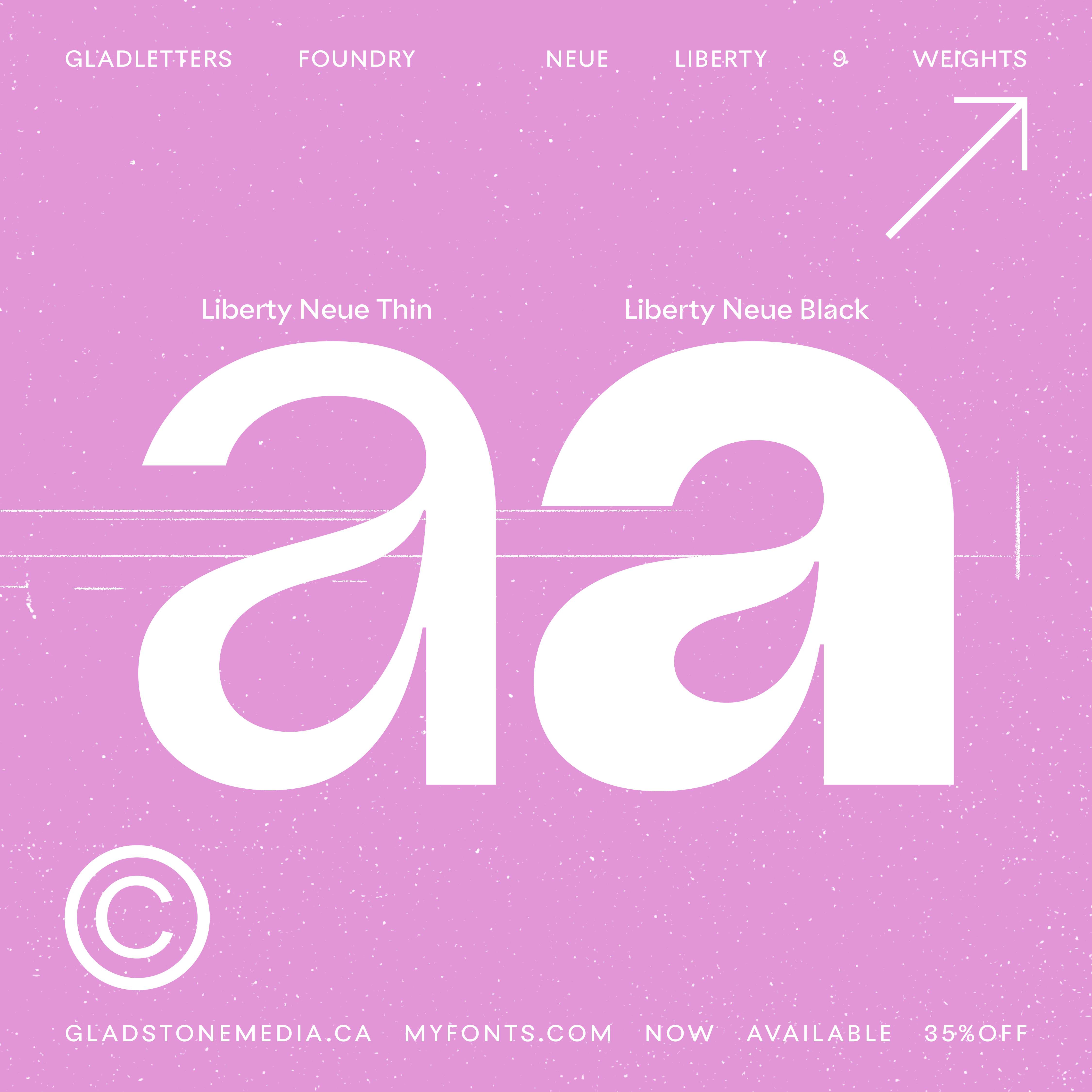
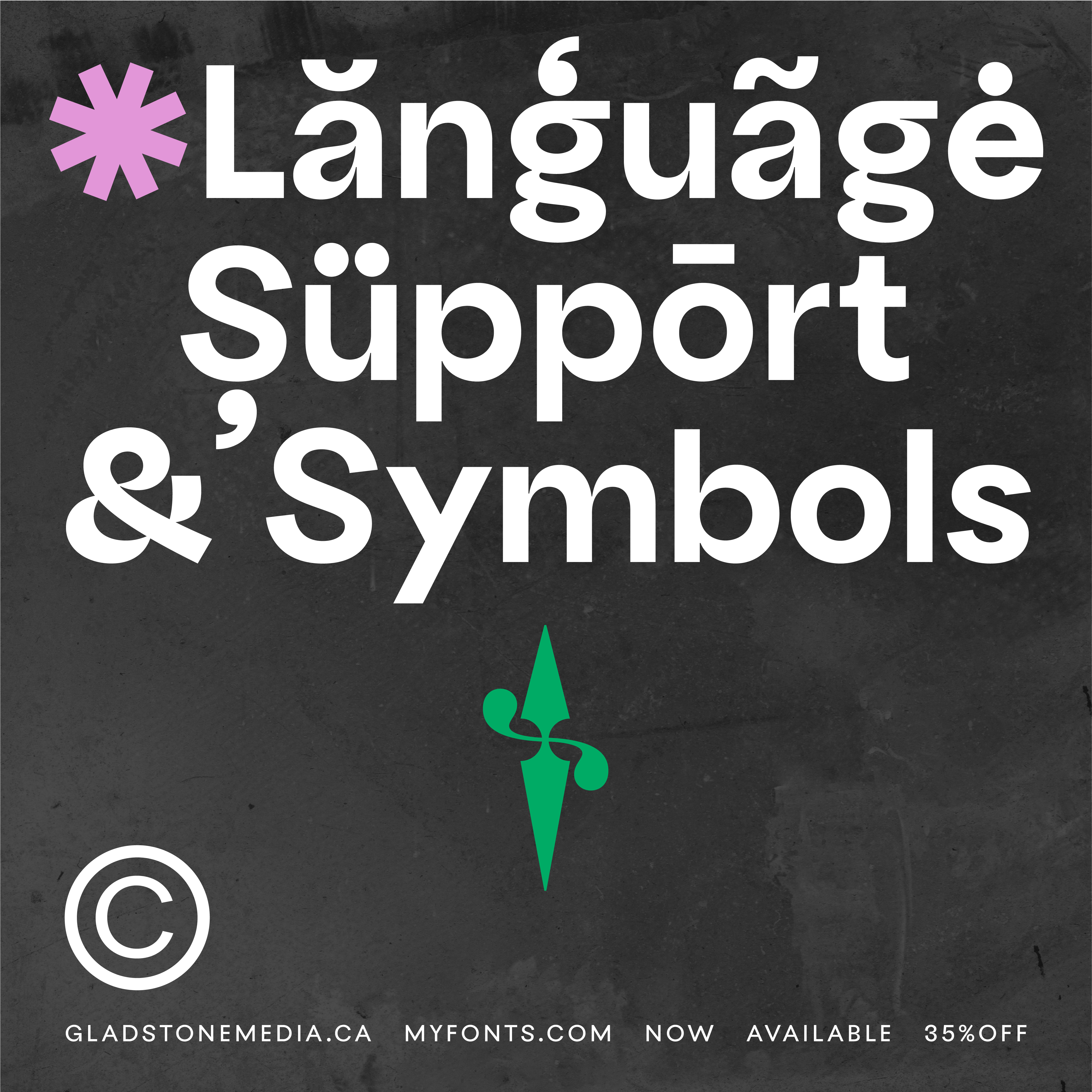
This passion extends beyond our client work and into our own brand expressions. Most recently, we created a custom font—Liberty Neue—which we are proudly releasing through our newly established font foundry, GLADletterd. This venture symbolizes our dedication to the art of typography and our belief in its ability to shape and enhance communication in ways that are both profound and timeless. Every curve, line, and letter in Liberty Neue is a reflection of our commitment to excellence in design and communication. This makes me glad, as it embodies the very essence of what we stand for at Gladstone Media—an unwavering passion for the written word and the beauty of typography.
THIS MAKES US GLAD.